

If you are already in business or just thinking about starting a business, you need to know how to create the right, effective logo. If your logo is recognizable, simple, but at the same time, creative and informative, most likely, you will not avoid success! Here are six rules to help you create the right logo.
- Business is important.
If your business is serious, then first of all handle geometric shapes, simple colors. If you are involved in, for example, fashion, then curls and petals will suit you. This rule is very important, since a higher level business culture requires that the client has an adequate idea of the company right away.
- Understand what you want. Formulate your requirements.
And only after that contact the designer. And even better to draw what you would like to see as the logo of your business. Before going to the designer, pick up a few examples of logos that you like. And do not worry if they do not correspond to the scope of your activities. Just so it will be much easier to understand what you like. And so the designer will be easier to formulate for you some suggestions.
- Use a maximum of two colors.
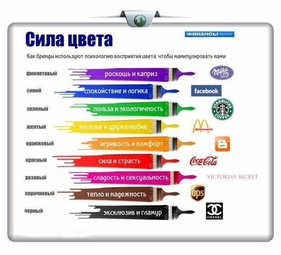
Most of the colors in my logo are mainly used by innovative companies, which seek to emphasize their non-standard (for example, Google). Also, the multicolor gamut of the logo is relevant for companies that are engaged in operational printing (well, here God himself ordered). But there are only 5% of such firms out of the total. Being “parrot” is not fashionable. Now restraint and style are in fashion. 95% of firms use one or two-color logos. It also allows you to take advantage of the meanings of the colors that you make the basis of your logo. The most popular colors in the logos are: blue (33%), red (29%), black or gray (28%). Another 13% of companies use the yellow color in the logo. All other colors (green, purple, pink, orange) account for a negligible number of companies. This is due to the fact that the colors-leaders are the most visible among the many advertisements and signs everywhere.
- Company name use is optional
But desirable. Maybe for you it will be a wonder, but 9% of companies do not use their name in the logo at all. And among them are such giants as Apple and Starbucks. Most often, only one image is not enough: the market for any goods and services is simply huge. If you draw on your logo only, say, a shoe, it will not be clear which company is involved. Therefore, a win-win advice – it is better to choose a text version with a picture, or even just a text logo.
- Text or image: what to focus on?
Those 41% of companies that have made themselves purely text logos, of course, greatly benefit about their recognition. But they lose out on the fact that they cannot send a hidden message to the consumer, the meaning of your company. Make a good text logo is much easier than a good graphic. Companies YouTube, Skype, Yahoo are betting on the text of their company and are not mistaken. In this matter, a lot depends on the designer.
- The font should not be random
Above this, it is worth working on and sorting through a lot of fonts Especially if you chose the text version of the logo. The font should also be associated with the scope of your business, and vary from severity to curl. If knowledge or acquaintances allow, it is better to use a non-standard font that has not yet been used in most logos familiar to most.